

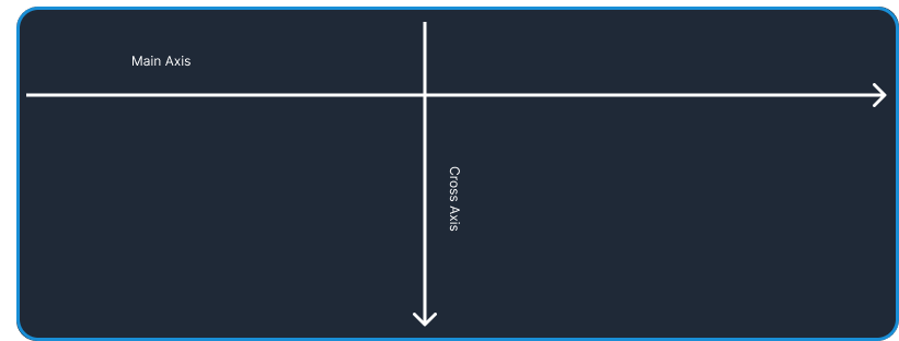
Main Axis
When working with a flexbox you need to think of two axes, The main axis, and the
cross axis. flex-direction property of the flex-box Is the main axis, by default the flex-direction is set as row flex-direction: row;
flex-direction
- flex-direction
- row
- row-reverse
- column
- column-reverse
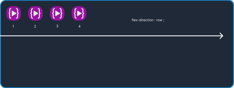
flex-direction : row
let's first see the flex-direction: row this is the default direction set on the main axis of the container from left to right.
.container{
display: flex;
flex-direction : row
}
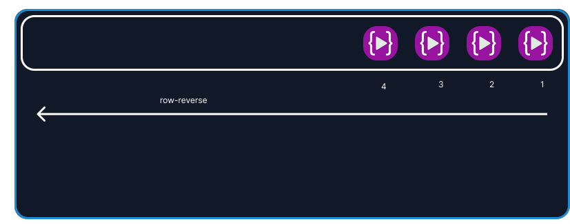
flex-direction : row-reverse
In the flex-direction: row-reverse the elements align on the main axis of the container starting from right to left
let's see the example
.container{
display : flex;
flex-direction : row-reverse ;
}
flex-direction : column;
In the flex-direction: column the main axis of the container goes from top to bottom
let's see the example hence all the elements align from top to bottom
.container{
display : flex;
flex-direction : column;
}
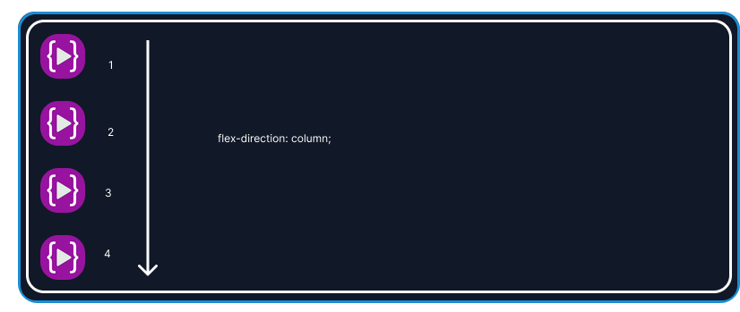
In the above example, I applied the flex-direction: column on a white container
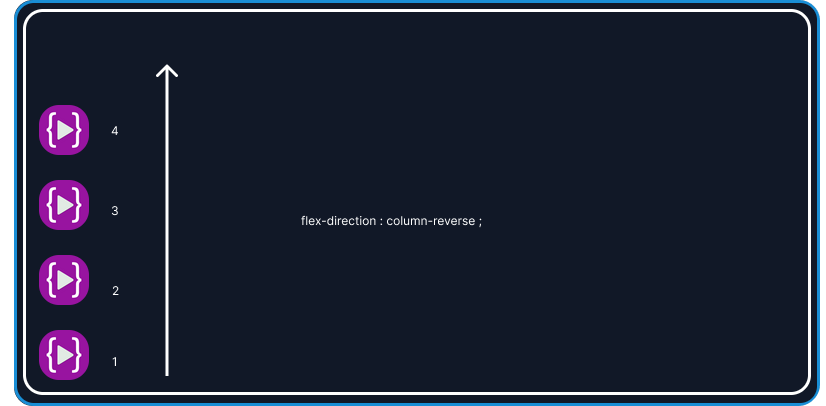
flex-direction : column-reverse ;
Like the above flex-direction: column example the main axis starts from the top to bottom but in the column the main axis starts from bottom to top all the elements on the main axis follow the direction
let's take a look at the below example
.container{
display : flex;
flex-direction : column-reverse;
}
justify content
let's see justify-content
- justify-content
centerflex-startflex-endspace-betweenspace-evenlyspace-around
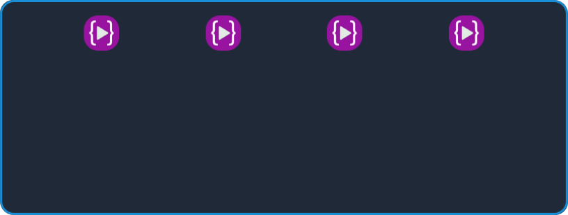
Let's first take a look at justify-content: center;
justify-content : center
To see the result we have to apply justify-content: center to the container div4
.container{
display : flex;
justify-content : center;
}

as you can see that all the elements inside the white container are set in the center of the main axis of the white container.
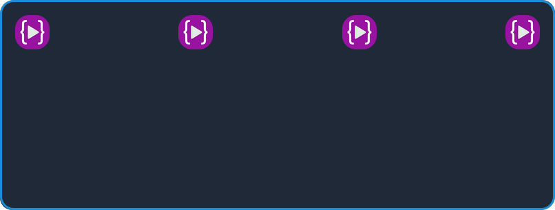
justify-content : flex-start
To see the result we have to apply justify-content: flex-start to the container
.container{
   display:flex;
   justify-content : flex-start;
}
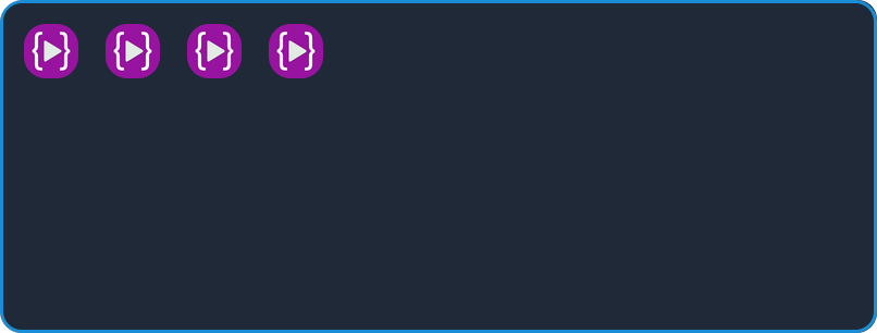
as you can see all the elements shifted toward left
note: In
flex-direction: rowThe main axis goes from left to right and the Row is the default direction of the flexbox until we change the direction torow-reverse,columnorcolumn reverse
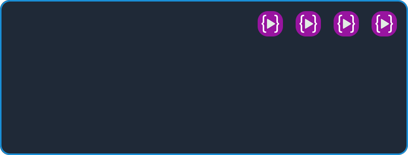
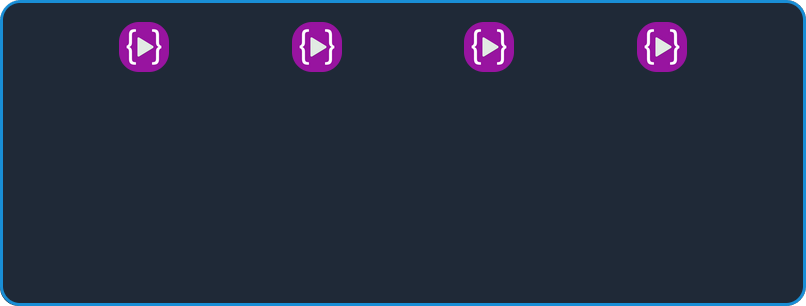
justify-content : flex-end;
like the above example in flex-start, all elements in the container are shifted at the start of the main axis but in the flex-end, all the elements shifted at the end of the main axis let's see the example;
.container{
display: flex;
justify-content : flex-end;
}
justify-content : space-between ;
In justify-content: space between all the elements in the container is evenly distributed on the main axis, the very first element on the main axis goes to the left end and the last element shifted to the right end
Let's see the example.
.container{
display : flex;
justify-content : space-between;
}
justify-content : space-evenly
This property equally distributes the element on the main axis. the space around the element is equal Let's see the example
.container{
display : flex;
justify-content: space-evenly;
justify-content : space-around
In the above example, space-evenly the space is equal between each element but in the space around the space is equal around the element
let's see the example
.content{
display : flex;
justify-content: space-around;
}
cross Asix
Using justify-content we are aligning the item on the main axis
align-item controls the alignment of an item on the cross axis this property is set directly to the child in the group
align-item
Let's see the most commonly use align-item values
- align-item
- flex-start
- flex-end
- center
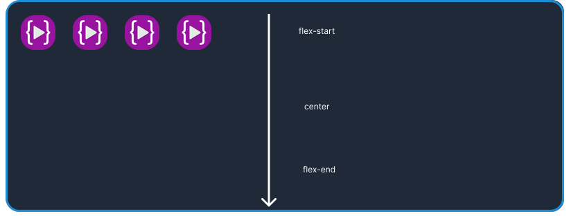
align-item : flex-start;
Align-item move the element on the cross axis
let's see on the default property set by the flex-box using display: flex
.container{
display : flex;
align-item : flex-start
}
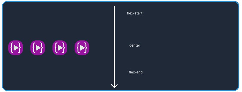
align-item : center
align-item moves all items to the center of the cross axis
let's see
.container{
display : flex;
align-item : center
}
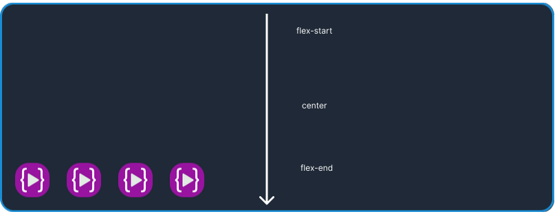
align-item : flex-end
align-item moves all item to the end of cross axis
let's see
.container{
display : flex;
align-item : flex-end
}
flex-wrap
The flex-wrap CSS property sets whether flex items are forced onto one line or can wrap onto multiple lines. If wrapping is allowed, it sets the direction in that lines are stacked.
- flex-wrap
- nowrap
- wrap
- wrap-reverse
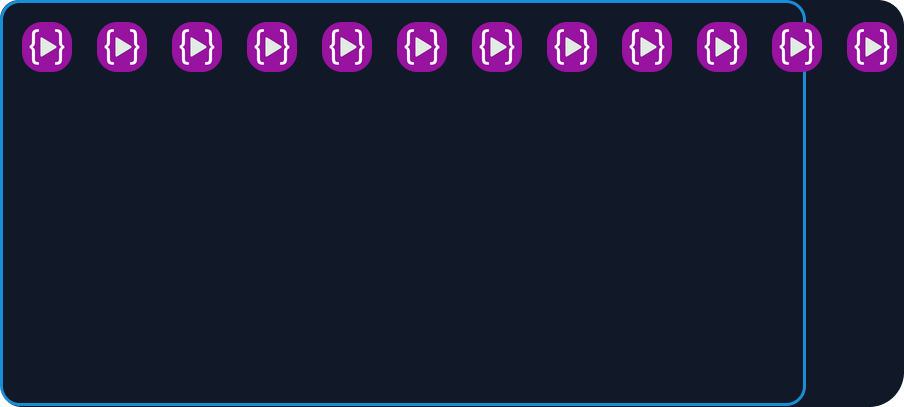
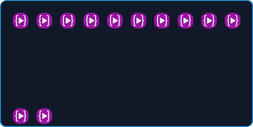
flex-wrap : nowrap
you can see no change in now-reap in the given example because by default the flexbox has nowrap
for the example, I have added learn code online image until it overflows the container
let's see the example;
.container{
display: flex ;
flex-wrap : nowrap ;
}
or
.container{
display: flex ;
}
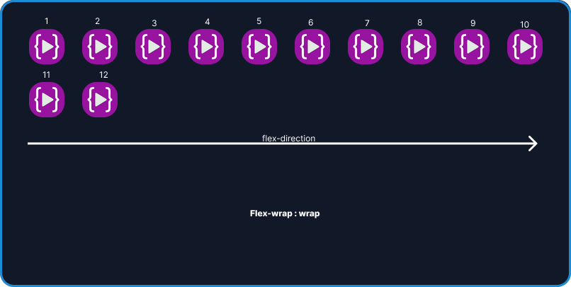
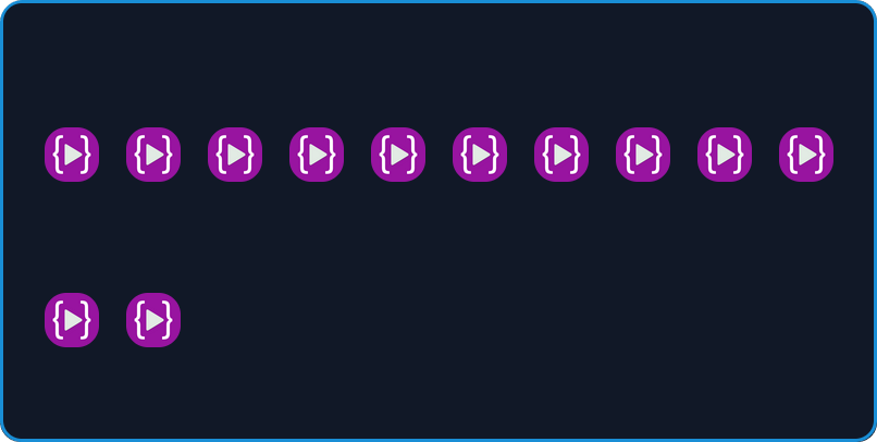
flex-wrap : wrap ;
As we apply flex-wrap to the container all the elements stay inside the container in the direction of the main axis means left to right
lets see the example
.container{
display:flex;
flex-wrap : wrap ;
}
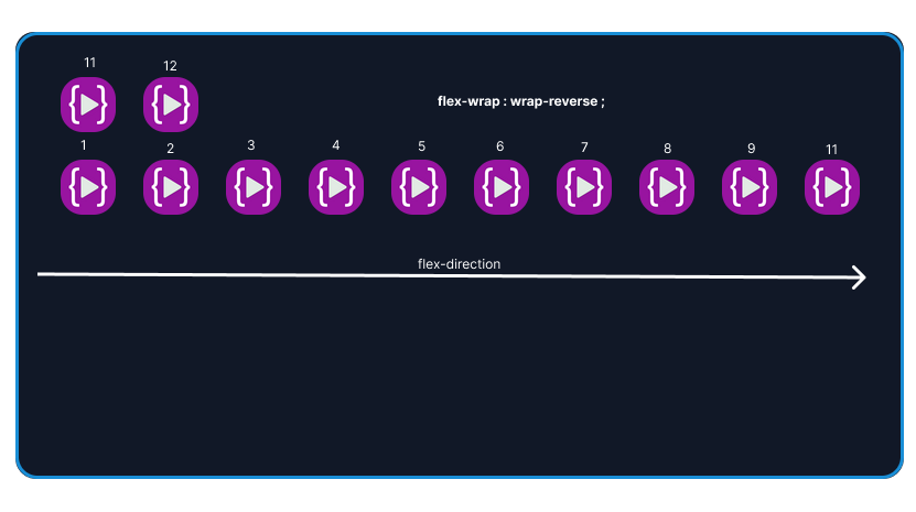
flex-wrap : wrap-reverse
flex-wrap: wrap-reverse is the same as ` flex-wrap: wrap` but the order or arrangement is changed
let's see the example
.container{
display: flex;
flex-wrap : wrap-reverse
}
align-content
The CSS align-content property sets the distribution of space between and around content items along a flexbox's cross-axis or a grid's block axis.
align-content will not work on single-line flex container
let's see the most commonly used align-content values
align-content
- flex-start
- center
- flex-end
- space-between
- space-around
- stretch
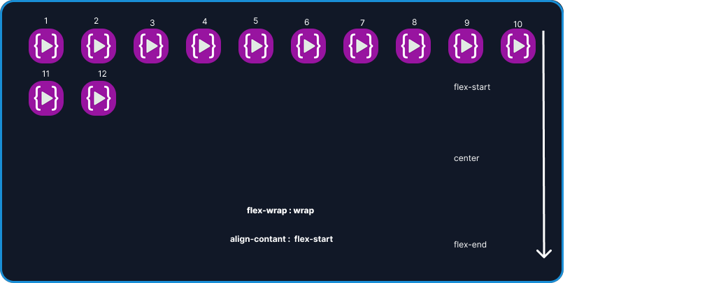
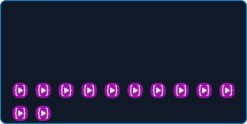
align-content : flex-start
In the align-content: flex-start all the elements go to the top of the container let's see the example
.container{
display: flex
flex-wrap: wrap
align-content : flex-start;
}
let's see the example
align-content : center
In the align-content: center all the elements go to the center of the container let's see the example
.container{
display: flex
flex-wrap: wrap
align-content : center;
}
align-content : flex-end
In the align-content: flex-end all the elements go to the end of the container let's see the example
.container{
display: flex
flex-wrap: wrap
align-content : flex-end;
}
align-content : space-between
In the align-content: the space between all the elements is separated evenly in the container let's see the example
.container{
display: flex
flex-wrap: wrap
align-content : space-between;
}
align-content : space-evenly
In the align-content: the space-evenly all the elements are separated evenly in the container the space between the line is equal let's see the example
```css .container{ display: flex flex-wrap: wrap align-content : space-between; }
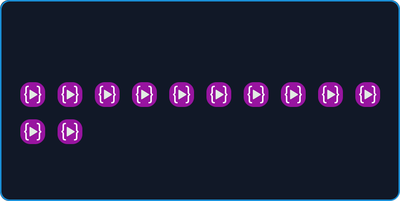
align-content : stretch
In the align-content: stretch all the elements are stretched vertically in the given example condition
let's see the example
```css .container{ display: flex flex-wrap: wrap align-content : stretch; }